Imagine your data analysis process as a puzzle – each piece representing valuable information waiting to be unlocked. Just like fitting together a puzzle requires patience and strategy, formatting your Excel data effectively is key to revealing the bigger picture. From organizing data with pivot tables to visualizing trends through charts, Excel offers a multitude of tools to elevate your analysis game. But what lies beyond these familiar methods? Uncover lesser-known yet influential Excel data formatting methods for better data analysis that can truly revolutionize the way you interact with your data.
Pivot Tables
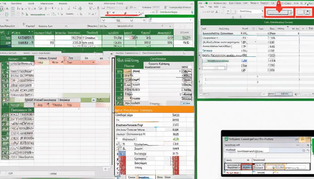
Pivot tables are a powerful tool in Excel for analyzing and summarizing data. They facilitate data visualization and aggregation by allowing you to extract meaningful insights from large datasets. With pivot tables, you can quickly organize and manipulate data to identify patterns, trends, and outliers within your information.
To create a pivot table, simply select your dataset and choose the fields you want to analyze. Excel then generates a dynamic table where you can drag and drop fields into rows, columns, values, or filters to customize your analysis. This flexibility enables you to view your data from various perspectives and gain a deeper understanding of its underlying patterns.
Charts
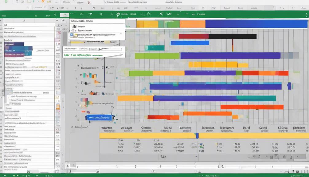
Analyzing data in Excel goes beyond just creating pivot tables. Utilizing charts for data visualization is key to spotting trends quickly. Charts offer a visual representation of your data, making it easier to identify patterns and outliers at a glance. When creating charts in Excel, consider using appropriate color schemes and designs to enhance clarity and highlight important insights.
Color schemes play a crucial role in making charts visually appealing and easy to interpret. Choose colors that are contrasting yet complementary to differentiate between data points effectively. Additionally, consider the overall design of the chart, including the type of chart that best represents your data. Whether it’s a bar graph, pie chart, or line graph, select the most suitable option to showcase your data accurately.
Data Tables
When working with data tables in Excel, you can focus on three key points: formatting, sorting, and conditional formatting. Formatting data tables allows you to make information more visually appealing and easier to interpret. Sorting and filtering functions help you organize data efficiently, while conditional formatting enables you to highlight important trends or outliers within the table.
Formatting Data Tables
To effectively present and organize data in Excel, mastering the art of formatting data tables is crucial. Data visualization plays a key role in enhancing the readability and understanding of your data. Utilizing color coding within your tables can help highlight important information, trends, or outliers, making it easier for you and others to interpret the data at a glance.
When formatting data tables, consider using different colors to represent varying data points or categories. For example, you could use a gradient color scale to show the intensity of a particular metric across different cells. Additionally, you can apply color coding to categorize data into groups or to emphasize specific values that require attention.
Sorting and Filtering
Mastering the sorting and filtering functions in Excel is imperative for effectively organizing and analyzing your data tables. Excel provides advanced filtering techniques that allow you to sift through large datasets with ease. By utilizing these advanced filtering options, you can quickly narrow down your data based on specific criteria, such as text, numbers, or dates. Moreover, Excel offers interactive sorting features that enable you to rearrange the data in ascending or descending order with just a few clicks. This functionality is particularly handy when you need to identify trends, outliers, or patterns within your data. Whether you are working with financial records, inventory lists, or survey results, understanding how to apply sorting and filtering in Excel is key to enhancing your data analysis capabilities. Take advantage of these powerful tools to streamline your workflow and gain valuable insights from your datasets.
Conditional Formatting
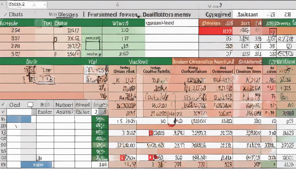
For effective data visualization and highlighting of key insights in your Excel data tables, utilizing Conditional Formatting is a powerful technique. When you apply Conditional Formatting, you can use color coding and cell highlighting to draw attention to specific data points based on set criteria. This feature allows you to instantly identify trends, outliers, or values that require further analysis within your dataset. By assigning different colors or formatting styles to cells that meet certain conditions, you can quickly spot patterns or anomalies in your data without manually scanning through each cell. This not only saves time but also enhances the readability and interpretability of your data tables. Whether you want to emphasize high or low values, track changes over time, or pinpoint exceptions in your data, Conditional Formatting provides a visually impactful way to make your data stand out and facilitate better decision-making.
Formulas
With Excel’s powerful functions, mastering formulas can significantly enhance your data processing capabilities. Formulas allow for advanced calculations and data visualization, making it easier to derive insights from your data. By utilizing formulas, you can perform complex mathematical operations, manipulate text, and analyze large datasets efficiently.
Excel offers a wide range of built-in functions that cater to different data processing needs. Functions like SUM, AVERAGE, and COUNT help in performing basic calculations, while more advanced functions such as VLOOKUP, IF, and CONCATENATE enable you to manage and analyze data in a more sophisticated manner. These formulas not only save time but also ensure accuracy in your calculations.
Furthermore, formulas can be used to create dynamic reports and dashboards that provide visually appealing data visualization. By linking formulas to charts and graphs, you can present your data in a more understandable and compelling way, aiding in better decision-making processes. Mastering formulas in Excel is essential for anyone looking to excel in data analysis and reporting.
Data Models
Data Models in Excel serve as powerful tools for organizing and analyzing complex datasets efficiently. When working with data models, consider the following key aspects:
- Data Visualization: Utilize data models to create visually engaging representations, such as charts and graphs, to better understand trends and patterns within your dataset.
- Data Interpretation: Data models aid in interpreting the information by providing a structured framework for analysis, helping you draw meaningful insights from the data.
- Data Accuracy: By using data models, you can ensure the accuracy of your analysis by establishing relationships between different datasets and performing calculations with precision.
- Data Integrity: Data models help maintain data integrity by allowing you to define rules and relationships that govern how data is stored and manipulated, reducing the risk of errors in your analysis.
Incorporating data models into your Excel workflow can significantly enhance your data analysis capabilities, leading to more informed decision-making processes.
Power Query
Power Query is a robust data connection tool in Excel that enables you to import, transform, and combine data from various sources with ease. With Power Query, you can perform essential data cleansing and transformation tasks to ensure your data is accurate and ready for analysis. This tool allows you to merge and shape data from different sources by applying various transformations such as filtering, sorting, and grouping. Power Query simplifies the process of combining data from multiple files or databases, saving you time and effort. By shaping your data using Power Query, you can easily format it to meet your analytical needs, making it more accessible and understandable. Additionally, Power Query provides a user-friendly interface that allows you to visualize the steps taken in the data transformation process, making it easier to replicate or modify them as needed. Mastering Power Query can significantly enhance your data analysis capabilities within Excel.
VBA Scripts
Utilize VBA Scripts to automate tasks and customize functionality within Excel. VBA (Visual Basic for Applications) Scripts can significantly enhance your data cleaning and automation techniques in Excel.
Markdown list:
- Automate repetitive tasks: VBA Scripts allow you to record and execute a series of actions, saving time on repetitive data cleaning processes.
- Customize Excel functionality: With VBA Scripts, you can create custom functions and features tailored to your specific data analysis needs.
- Enhance data cleaning: VBA Scripts enable you to perform complex data cleaning operations efficiently, ensuring your data is accurate and ready for analysis.
- Integrate external data sources: By using VBA Scripts, you can automate the process of importing and cleaning data from external sources, streamlining your workflow.
Macros
When working with Excel, Macros serve as powerful tools that can automate repetitive tasks and enhance your efficiency. Macros allow for advanced automation within Excel, enabling you to record a sequence of commands and actions that can be automatically executed with a single click. By utilizing Macros, you can streamline complex processes and eliminate the need for manual intervention in tasks that are often repeated. This results in efficiency optimization, saving you time and reducing the risk of errors in your data analysis workflows.
To create a Macro, you can record a series of steps or write a script using the Visual Basic for Applications (VBA) editor in Excel. Once created, Macros can be assigned to buttons, keyboard shortcuts, or custom menus for quick access. This level of automation can significantly boost your productivity by simplifying repetitive tasks and allowing you to focus on more critical aspects of data analysis.
Data Validation
Incorporating data validation techniques is a fundamental aspect of maintaining accuracy and consistency in your Excel spreadsheets. When it comes to data input and error prevention, utilizing data validation features can greatly enhance the quality of your data analysis. Here are four key benefits of implementing data validation in your Excel spreadsheets:
- Ensure Data Accuracy: By setting specific criteria for data input, such as numerical ranges or predefined lists, you can prevent the entry of incorrect or inconsistent data.
- Improve Data Consistency: Data validation helps in standardizing the format of your data, ensuring uniformity across the spreadsheet and making analysis more reliable.
- Prevent Errors: Setting validation rules like date constraints or text length limits can help in minimizing errors during data entry, leading to cleaner datasets.
- Enhance Data Integrity: By restricting the type of data that can be entered in each cell, data validation safeguards the integrity of your dataset, promoting better data analysis outcomes.
Data Sorting
When organizing your data in Excel, sorting by single criterion allows you to arrange information in a specific order. By utilizing custom sorting, you can further refine how your data is organized to suit your needs. These methods provide you with the flexibility to arrange your data efficiently and effectively.
Sort by Single Criterion
To efficiently organize and analyze your data in Excel, sorting by a single criterion is a fundamental feature that allows you to arrange your information in a specific order. When sorting data in Excel, you can choose to organize it in ascending or descending order based on a single criterion. Here’s how you can make the most out of this feature:
- Ascending Order: Sort data from the smallest to the largest value or from A to Z.
- Descending Order: Arrange data from the largest to the smallest value or from Z to A.
- Alphabetical Sort: Useful for organizing text data alphabetically, such as sorting names or categories.
- Numerical Sort: Ideal for arranging numerical data in a specific order, like sorting sales figures or ages.
Utilize Custom Sorting
For enhanced data organization flexibility, Excel offers the feature of custom sorting, allowing you to arrange your information based on specific criteria tailored to your needs. Custom sorting goes beyond the basic alphabetical or numerical sorting options, giving you advanced control over how your data is organized. By utilizing custom filtering, you can define unique sorting rules that Excel will follow when arranging your dataset. This personalized grouping of data enables you to prioritize certain values, categories, or conditions, leading to enhanced organization and a clearer insight into your information.
When working with large datasets or complex information structures, custom sorting becomes a valuable tool for streamlining your analysis process. Instead of being limited to traditional sorting methods, you can create custom sorting orders that match your specific requirements. This level of flexibility empowers you to uncover patterns, trends, and relationships within your data more efficiently, ultimately improving the accuracy and depth of your analysis. Custom sorting in Excel is a powerful feature that allows you to take control of your data organization and optimize your workflow for better decision-making.
Data Filtering
One effective method for managing large datasets in Excel is through the use of data filtering. Data filtering allows you to focus on specific information within your dataset, making it easier to analyze and draw insights. Here are some tips to make the most out of data filtering:
- Utilize Advanced Filtering Techniques: Excel offers various advanced filtering options such as filtering by color, text filters, or custom criteria. Experiment with these features to tailor your data display to your specific needs.
- Follow Data Filtering Best Practices: Ensure your dataset has clear headers and is organized before applying filters. This will help you avoid errors and confusion when filtering your data.
- Combine Multiple Criteria: Excel allows you to apply multiple criteria when filtering data. By combining different criteria, you can extract more precise information from your dataset.
- Use Filter Views: Filter Views in Excel enable you to save different filter settings for quick access. This is useful when you need to switch between different filtered views of your data.
Conditional Formatting
Conditional Formatting in Excel is a powerful feature that allows you to visually highlight important information within your dataset based on specific conditions. By utilizing color coding, you can assign different colors to cells that meet certain criteria, making it easier to identify trends or outliers at a glance. For example, you can set up conditional formatting to turn cells with values above a certain threshold into red, indicating potential issues that require attention.
Another useful tool within conditional formatting is the implementation of icon sets. Icon sets allow you to display icons such as arrows, flags, or symbols within cells to represent different levels of data. This feature is handy when you want to quickly assess performance, rankings, or progress in your dataset. For instance, you can use icon sets to show if values are increasing, decreasing, or staying the same, providing a visual aid for better data interpretation. By leveraging both color coding and icon sets, you can enhance the visual representation of your data and improve the efficiency of your analysis.
Frequently Asked Questions
How Can I Protect My Excel Data From Unauthorized Access or Changes?
To safeguard your Excel data, enact draconian measures! Implement stringent access controls and robust data encryption. Protect your data like a vault, ensuring unauthorized access is thwarted, and changes are a distant impossibility.
What Are the Best Practices for Naming Cells and Ranges in Excel?
When naming cells and ranges in Excel, ensure clarity and consistency. Use meaningful names that reflect content. For cell referencing, employ absolute or relative references as needed. For range naming, designate descriptive names for easy identification.
Is It Possible to Track Changes Made to an Excel Spreadsheet?
Yes, it is possible to track changes in Excel through version control and audit trails. Ensure user permissions are set correctly to monitor edits. Consider encryption for added security. These features enhance transparency and data integrity.
Can Excel Handle Large Datasets Efficiently for Analysis?
You bet Excel can handle those massive datasets efficiently for analysis! With smart data visualization techniques and speed optimization strategies, you’ll be slicing through numbers like a hot knife through butter. Go Excel!
How Can I Collaborate With Others on an Excel Spreadsheet Securely?
To collaborate securely in Excel, use the “Share” feature to enable collaborative sharing. Set permissions for secure access. Control who can view and edit the spreadsheet. Real-time updates ensure everyone has the latest information.


