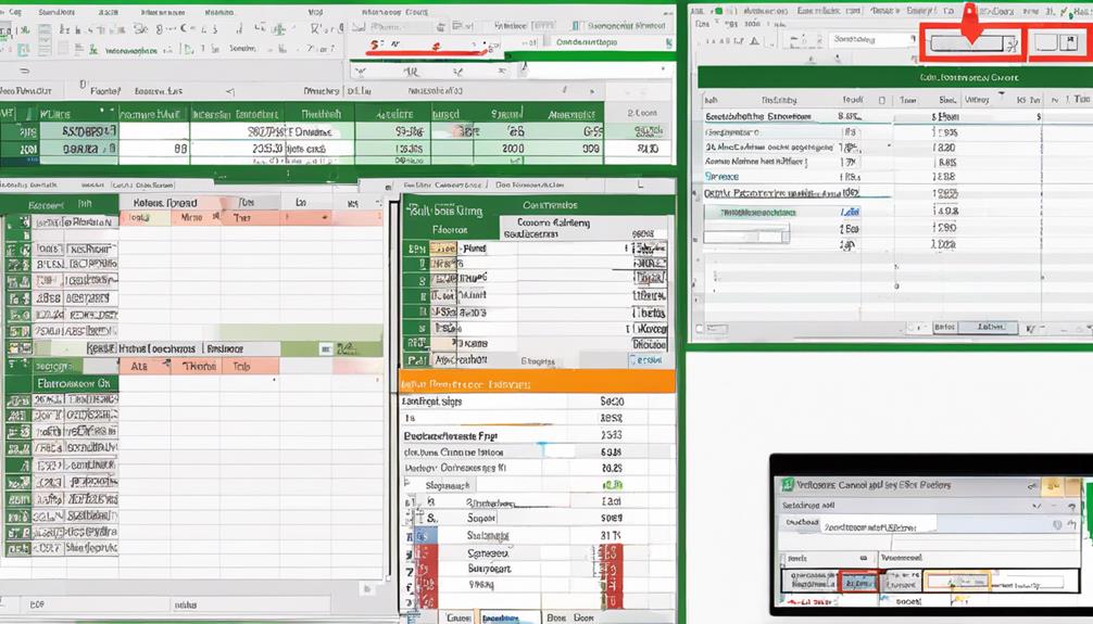
Did you know that mastering specific Excel data formatting techniques can significantly enhance the visual impact of your data presentations? By incorporating these strategies, you can transform raw data into insightful visualizations that are not only visually appealing but also easier to interpret. From simple font adjustments to more complex interactive features, Excel offers a range of tools that can elevate your data visualization game to new heights. Explore these techniques further to unlock the full potential of your data visualization projects.
Formatting for Charts
When creating charts in Excel, proper formatting is crucial to effectively communicate your data. Font styles play a significant role in enhancing the readability and visual appeal of your charts. Choosing appropriate font styles for titles, labels, and data values can make a significant difference in how easily your audience can interpret the information presented. Opt for clear and easily readable fonts to ensure that your data is conveyed clearly.
Data labels are another essential aspect of chart formatting. They provide crucial context to the data points displayed in the chart. Ensure that your data labels are concise yet informative, allowing viewers to quickly grasp the key insights without being overwhelmed by unnecessary information. Properly placed and formatted data labels can make your charts more professional and user-friendly.
Formatting for Pivot Charts
When formatting for pivot charts in Excel, consider utilizing different chart color schemes to enhance visual appeal and highlight data distinctions effectively. Customize axis labels to provide clarity and make the chart easier to interpret for your audience. These formatting techniques play a crucial role in presenting your data in a meaningful and visually engaging way.
Chart Color Schemes
To enhance the visual impact and effectiveness of your pivot charts in Excel, mastering chart color schemes is essential. When choosing colors for your pivot charts, consider using gradient backgrounds and bold labels to make your data stand out effectively.
- Gradient Backgrounds: Utilizing gradient backgrounds in your pivot charts can add depth and dimension to the visual representation of your data. Experiment with different color combinations to find the gradient that works best for highlighting your insights.
- Bold Labels: Employing bold labels in your pivot charts can help draw attention to key data points or categories. Make sure the labels are easy to read and stand out against the background colors to ensure clarity in your visualizations.
- Color Consistency: Maintain consistency in your color schemes across different charts to create a cohesive and professional look. Consistent colors help viewers easily interpret and compare the information presented in various charts.
Axis Label Customization
For effective communication of data insights in pivot charts, mastering Axis Label Customization is crucial. When customizing axis labels in pivot charts, pay attention to the data labels and font style. Data labels provide clarity by directly displaying the values associated with each data point on the chart. Customize these labels to be concise yet informative, ensuring they enhance rather than clutter the visualization. Adjusting the font style of axis labels can significantly impact the overall look and readability of the chart. Choose a font that is clear, legible, and appropriately sized for easy viewing. Experiment with different font styles to find the one that best suits your data visualization needs. By refining the data labels and font style in your pivot charts, you can effectively highlight key information and improve the overall visual appeal of your data presentations.
Formatting for Sparklines
Excel offers a range of formatting options to enhance the visual impact of your Sparklines. When it comes to Sparkline design and customization, it’s essential to make the most out of Excel’s features for better data visualization.
- Color Coding: Utilize different colors for positive and negative trends in your Sparklines to make them more visually appealing and easier to interpret.
- Marker Customization: Adjust the size and style of markers in your Sparklines to highlight specific data points or trends effectively.
- Axis Scaling: Properly scale the axes of your Sparklines to ensure that the data is presented clearly and accurately, allowing viewers to grasp the trends at a glance.
Formatting for Conditional Formatting Visualization
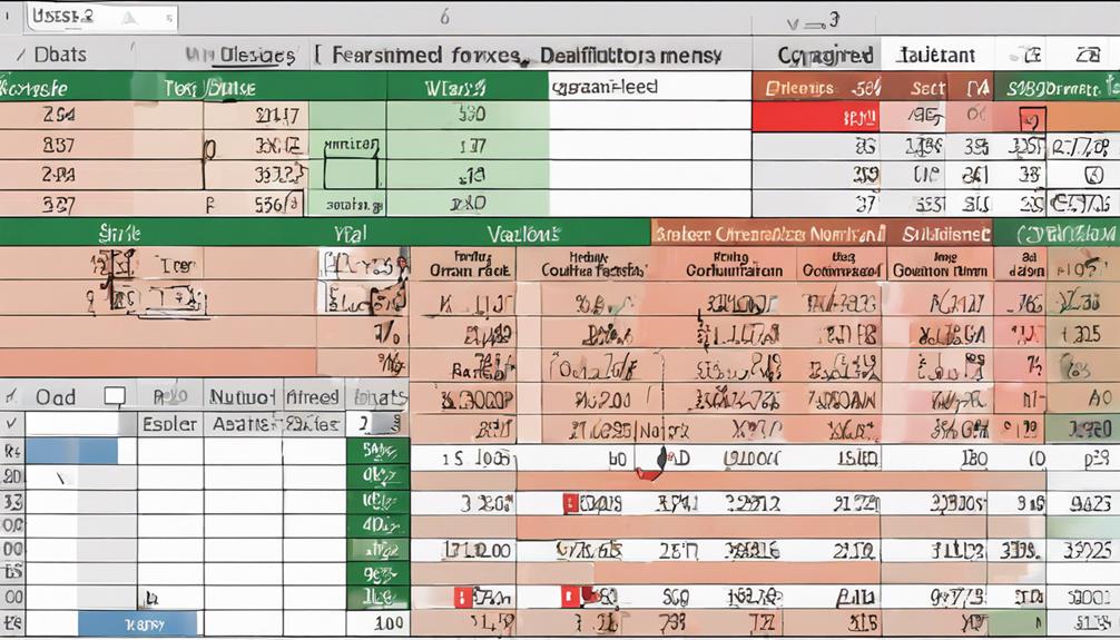
When it comes to enhancing your Excel spreadsheets for better data visualization, utilizing color-coded data cells and icon-based formatting through conditional formatting can greatly assist in highlighting important information. By assigning specific colors to different data ranges or using icons to represent certain trends or values, you can make your data more visually impactful and easier to interpret at a glance. These formatting techniques provide a quick and intuitive way to draw attention to key insights within your data sets.
Color-Coded Data Cells
To enhance data visualization and quickly identify trends or outliers in your Excel spreadsheets, utilizing color-coded data cells through conditional formatting is a powerful technique. By applying gradient shading and heat map styling to your data cells, you can effectively convey information and highlight important insights. Here are three key benefits of using color-coded data cells:
- Improved Data Interpretation: Color-coding allows you to assign different shades to data points based on their values, making it easier to spot high or low values at a glance.
- Enhanced Visual Appeal: Using a visually appealing color scheme can make your data more engaging and easier to comprehend, especially when presenting to others.
- Quick Identification of Patterns: With color-coded cells, patterns and correlations within your data become more apparent, enabling you to make informed decisions swiftly.
Incorporating color-coded data cells in your Excel spreadsheets can significantly enhance data visualization and streamline your analytical processes.
Icon-Based Formatting
Utilizing icon-based formatting in your data analysis endeavors can provide a visual representation of your data’s insights. When incorporating icon design into your Excel spreadsheets, you can enhance the readability and interpretability of your data. By assigning different data icons to specific values or ranges, you create a quick and easy way for viewers to grasp the significance of the information at hand.
Excel offers a range of built-in data icons that can be customized based on your preferences. These data icons can represent trends, status, ratings, and more, allowing you to convey complex information in a simplified manner. By strategically applying data icons through conditional formatting, you can draw attention to key data points, outliers, or patterns within your dataset.
Icon-based formatting not only adds visual appeal to your spreadsheets but also aids in highlighting important data relationships. Whether you’re analyzing sales figures, survey responses, or project timelines, data icons can help you communicate your findings effectively to your audience.
Formatting for Data Tables
Data tables are essential tools for organizing and presenting information in a structured format. When formatting data tables in Excel, consider utilizing data alignment techniques and font style choices to enhance readability and visual appeal.
- Data Alignment Techniques: Proper alignment of data within cells can significantly improve the clarity of your data tables. Use options like aligning text left, right, or center to create a clean and organized look.
- Font Style Choices: Selecting appropriate font styles can make a big difference in how your data is perceived. Opt for clear and easy-to-read fonts such as Arial or Calibri, and adjust the font size to ensure readability without overcrowding the cells.
- Consistent Formatting: Maintain consistency in formatting throughout the table. Use the same font style, size, and color for headers, data entries, and footnotes to create a cohesive and professional appearance.
Formatting for Slicers
When enhancing the visual presentation and functionality of your Excel spreadsheets, attention to detail in formatting for slicers is crucial. Slicer design plays a significant role in how users interact with and filter data. To optimize slicer design, consider aligning slicers neatly, using consistent colors, and adjusting sizes for a polished look. By creating a visually appealing layout, users can easily identify and utilize slicers to refine data views.
Slicer interaction is another key aspect to focus on when formatting slicers. Ensure that slicers are intuitive to use, with clear labels and logical groupings. This will enhance user experience and make data analysis more efficient. Additionally, consider enabling multi-select options for slicers to allow users to choose multiple filter criteria simultaneously.
Formatting for Timelines
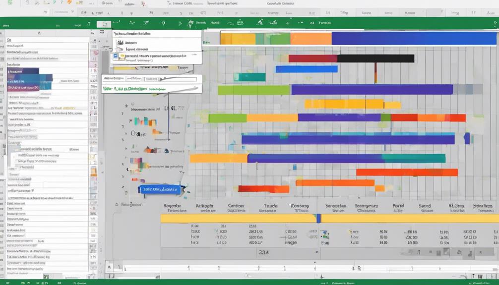
Enhancing the visual representation and functionality of your Excel spreadsheets extends to formatting for timelines. When working with timelines in Excel, it is crucial to focus on timeline design and data visualization techniques to effectively convey information. Here are some key points to consider:
- Clear Date Ranges: Ensure that your timeline clearly displays the date ranges you are working with. Use appropriate date formats and labeling to make it easy for users to understand the time frame being represented.
- Color Coding: Utilize color coding to differentiate between different time periods or categories within your timeline. This can help users quickly identify trends, patterns, or specific data points.
- Interactive Features: Implement interactive features such as scroll bars or slicers to allow users to easily navigate through the timeline and focus on specific time intervals or data points.
Formatting for Power View
When working with Power View in Excel, understanding the basics is crucial for creating compelling visualizations. Utilize formatting tips to enhance the presentation of your data and make it more engaging for your audience. Implement visualization best practices to ensure your Power View reports effectively communicate insights and drive decision-making.
Power View Basics
To work effectively with Power View in Excel, understanding the basics of formatting is essential. Power View offers powerful interactivity features and data exploration techniques that can help you create dynamic visualizations. Here are three key points to keep in mind when working with Power View:
- Interactivity: Power View allows users to interact with visualizations by clicking on elements to filter data dynamically. This feature enhances the user experience and enables deeper exploration of the dataset.
- Data Exploration Techniques: Utilize features like slicers and timelines in Power View to segment and analyze data from different perspectives. These tools help in uncovering insights and trends within the dataset.
- Visualization Customization: Customize the appearance of charts, graphs, and tables in Power View to make the data more visually appealing and easier to interpret.
Formatting Tips
To improve the visual impact and effectiveness of your Power View visualizations, proper formatting is crucial. When working on formatting for Power View, pay attention to font size and cell alignment. Utilizing appropriate font sizes is essential for readability and emphasis. Ensure that titles and headings are larger to grab attention, while the main body text remains smaller for clarity. Consistent font sizes throughout your visualization will create a cohesive look. Additionally, proper cell alignment enhances the overall appearance of your data. Aligning text to the left for labels and headers and to the right for numerical data can help in better comprehension. Center-aligning titles and headings can make them stand out. Consistent cell alignment across your Power View reports will give them a polished and professional look. By focusing on font size and cell alignment, you can elevate the visual appeal and clarity of your Power View visualizations.
Visualization Best Practices
For optimal presentation of data in Power View, adhering to visualization best practices is essential. When formatting your data for Power View, keep in mind the following key points:
- Data labeling: Ensure that all data points in your visualization are clearly labeled. Properly labeling your data will help viewers understand the information being presented without confusion.
- Chart legends: Utilize chart legends effectively to provide context to your visualizations. A well-designed legend will help viewers interpret the data accurately and make informed decisions based on the information displayed.
- Consistent formatting: Maintain consistency in your data formatting throughout the visualization. Consistent use of colors, fonts, and styles will create a cohesive look and make it easier for viewers to follow the information presented.
Formatting for Power Map
When preparing your data for Power Map, the formatting plays a crucial role in ensuring a visually appealing and informative representation of your information. Power Map allows for 3D mapping visualization, creating interactive and engaging visualizations. To optimize your Power Map visualization, focus on heat map customization. By adjusting the color gradients, intensity levels, and data ranges, you can effectively highlight patterns, trends, and variations within your data. Utilize contrasting colors for high and low values to make your heat map more visually striking and easier to interpret. Remember to carefully structure your data before importing it into Power Map to ensure a seamless visualization process. Experiment with different formatting options to find the most effective way to present your data in a clear and engaging manner. By paying attention to formatting details, you can enhance the impact and clarity of your 3D mapping visualization in Power Map.
Formatting for Data Validation Visualization
Enhance the effectiveness of your data validation process by focusing on the formatting for data visualization. When it comes to formatting for data validation visualization in Excel, there are key techniques that can help you present your data in a clear and organized manner.
- Data Sorting: Utilize Excel’s sorting functionality to arrange your data in a logical order based on specific criteria. This can help you identify patterns and outliers more easily during the validation process.
- Cell Highlighting: Highlighting cells based on certain conditions or rules can draw attention to important data points or potential errors. Use conditional formatting to automatically highlight cells that meet certain criteria, making it easier to spot discrepancies.
- Data Validation Rules: Implement data validation rules to ensure that the entered data meets specific criteria or constraints. This can help maintain data integrity and accuracy throughout your Excel sheets.
Frequently Asked Questions
How Can I Use Excel Data Formatting to Improve Data Accuracy?
To enhance data accuracy through Excel data formatting, focus on ensuring data consistency and improving format visibility. By applying consistent formatting rules and utilizing visual aids like color coding, you can effectively enhance the accuracy of your data.
What Are the Best Practices for Applying Conditional Formatting in Excel?
To excel at applying conditional formatting in Excel, utilize heat maps for visual data insights and icon sets for quick interpretation. Ensure clarity and consistency in color choices to enhance data visualization effectively.
Can Excel Data Formatting Help in Identifying Trends in Data?
Yes, Excel data formatting can assist you in identifying patterns and data trends effectively. By utilizing formatting features like color scales, data bars, and icon sets, you can visually highlight key insights and make trends more apparent.
How Can I Customize Data Tables for Better Visualization in Excel?
To customize data tables for better visualization in Excel, start by integrating sparklines to show trends at a glance. Utilize color coding to highlight patterns and make comparisons easier. These techniques enhance data interpretation and decision-making.
Are There Any Shortcuts for Efficient Data Validation Visualization in Excel?
To enhance data validation visualization in Excel, use conditional formatting for quick insights on data accuracy. Utilize color scales, data bars, and icon sets to efficiently spot trends or anomalies in your datasets.


